Zeta x Midjourney
Redesign Midjourney to expand beyond Discord, creating an accessible platform that attracts new users.

Midjourney has gained traction among digital creators & enthusiasts, primarily within the Discord platform. While this setting has supported an early adopter community, It’s niche nature limits Midjourney’s growth potential. New Users need to onboard onto discord and Midjourney to use it.
Project Type
Design Sprint
My role
Primary UI UX Designer
Time
7 Hours
*This Design Sprint was mentored in collaboration with Zeta
Old User Experience
Without a free starter plan and a seamless login, new users face a high barrier to entry.
This paywall and complex onboarding process can feel intimidating, making users less likely to explore the platform's benefits and more likely to seek free alternatives.
Problem Statement
Through a thorough analysis of competitor workflows + UserJourneys, a SWOT evaluation, and a detailed design audit, we identified these key user experience challenges.
Unique Social Advantage
Midjourney’s strength lies in its social prompting through Discord, allowing users to create alongside friends—a feature that sets it apart from competitors.
Dual Onboarding Friction
Requiring users to onboard onto both Discord and Midjourney creates a complex entry process, potentially deterring new users.
High Barrier Due to Paywall
An upfront paywall can discourage exploration, preventing users from discovering the platform’s full potential before committing as in a free-to-use scenario.
Limited Awareness of Use Cases
Many general users lack an understanding of Midjourney’s potential applications and need a structured learning path to discover personalized use cases.
Missed Opportunities in Social Sharing
The platform could better leverage its social features to encourage users to share their creations on social media, attracting new users and friends through organic growth.
Need for Purposeful Skill Development
Users benefit from upskilling and having more structured pathways to grow their skills; otherwise, they may lose interest after only basic prompting and experimentation.
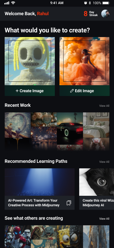
Solutions - Create 4 screens from new user journey
Screen Breakdown
Solution
How Community grows Audience?
In a sector that is still truly for enthusiasts, I focussed on lowering the entry barrier, skill barrier, and then an ecosystem to keep you there.
This will drive sustainable growth to 10x your audience.
System Design Reference
Google pay (Homepage), Skillshare (Learning Paths), Pintrest (Pinning, sharing, Commenting, saving), Duolingo (Streaks)
UI Design Reference
Midjourney Design System, Pinterest, Udemy Cards design

"People ignore design that ignores people."
Frank Chimero
My Learnings
This project was the result of a 7-hour design sprint along with senior designers at Zeta, and it was an incredible learning experience.
I am deeply grateful to the senior designers at Zeta for their invaluable guidance and mentorship throughout this journey. Their insights and constructive feedback helped me refine my approach to problem-solving and design execution.
During the sprint, I gained hands-on experience in tackling real-world challenges, prioritizing user needs, and delivering solutions within tight timelines. It also taught me the importance of collaboration, clear communication, and adaptability when working under pressure.
This experience has not only strengthened my design skills but also reinforced my passion for creating impactful and user-centered solutions. I’m excited to carry these learnings forward and apply them to future challenges.
Sia Shetty, My Team lead - Godrej Future Factory


